edX Master Rebrand
Click the link to jump to the section:
FYA Campaign
+ edX Rebrand
ROLE
Brand designer
Illustrator
Web designer
CLIENT
edX

PURPOSE
To design a new campaign inspired by new persona data and updated brand positioning.
RATIONALE
To showcase our company’s updated brand positioning, influenced by newfound persona data, our senior leadership team sought to roll out a campaign inspired by the rallying cry “fuel your ambition”.
We received full creative freedom to design outside the scope of the legacy edX branding, with the caveat that we have a compressed timeline and we would need to show a variety of assets to convey how these concepts could scale across platforms.
Collaborating closely with the senior copywriter, and leaning into our assigned conceptual themes, we produced three distinct concepts:
The first concept lead with our savvy DNA theme. Based around movement and energy, it included vibrant colors, lines, and type styles that felt energetic. It also balanced tech and human touch. Photography emphasized authenticity through depictions of humble confidence, leadership, and determination, and the copy responses were direct.
Concept 1


My concept lead with our Sincere DNA theme. It paired bold photography and photos manipulations to capture the human-first priority while also conveying the present/future journeys of learners. The imagery focused on the individual, used textures and neutralized color palette, and clean typography. The copy for this section written to sound aspirational.
Concept 2


The final concept lead with the resolute DNA theme. It created a strong sense of momentum. Learners looked energized, confident, and dynamic paired with vibrant floods of color. This design captured aspiration and joy with its pop-out photography and bold typography that physically leaned into the momentum. Copy for this concept conveyed concrete examples of success.
Concept 3


Leadership moved forward with concept 3, allowing us to dive deep into the bold, flat colors and vibrant typography. These proved to be a refreshing change from the edX’s electric, cool-tone palette and mono-spaced typography. With the theme solidified, we began producing a toolkit of photography guidelines, color and typography rules, messaging angles, and consumer expression examples.
From Campaign toolkit to Brand Guidelines
As we developed the campaign, we noticed stakeholders were excited to use this work in projects. This lead to senior leadership’s eventual request of an official rebrand in this campaign style. This also posed an important question: How might we elegantly bridge the legacy assets with the Fuel Your Ambition campaign in a way that referenced past work while still leaning into the vibrant new future?
The following sections detail how we transitioned this concept from a campaign toolkit to a brand book.

Color + Typography

“Fuel Your Ambition’s” campaign’s color palette differed from the legacy brand’s. The campaign colors balanced the serious tones of the fern, elm, and putty, with a punchy orange and pink. When placed into combinations, the creative could skew masculine, feminine, youthful, or mature. In contrast, the edX legacy palette mostly presented as electric, professional and masculine.

Typography updates also played a role in conveying this new momentum while also paying homage to legacy styling. We took Inter, the legacy typeface, and used new font weights. These thicker weights revealed the roundness of the letterforms, creating a softer, approachable look to the typography. Being strategic in the letter casing and the text degree skew created more variety for designing promotional and brand awareness assets.
These color and typography rules allowed us to add nuance to the original campaign. They provided guidelines of when the brand should yell, when it should whisper, and what the quality of those sounds should feel like.


To bridge the gap between FYA and Legacy, we created rules for color, separating them into primaries and secondaries. This allowed us to maintain the familiarity of our legacy elm color while also introducing flairs (pink and orange) that add warmth and brightness.
Photography
For photography, we returned to our brand positioning and unpacked the concept of ambition. The word holds a grinding, overworked sentiment. We wanted to move away from this to shift into a self-aware brand. People lead lives that are messy, bustling, and filled with more than professional development goals. Achievement can include spending more time with family, getting a new job to purchase a new house, or discovering a new passion. It was important in this post-Covid era, where online education is no longer novel, to differentiate ourselves by showcasing an awareness and an authentic support of these hopes and dreams beyond the digital classroom.

We also wanted to be mindful of emotion. Joy was such a defining factor in the original concept, but we found joyful photos assumed success. Since our learners’ professional goals aren’t on a linear path and our personas differ immensely, being mindful of the expressions we sourced in photography lead to authentic, intentional designs. Our exploration to the left conveys a spectrum of emotional experiences related to learner milestones.
From a stained coffee cup to a messy work desk, our lives are filled with small moments of time that helped to define who we are. We found that adding variety to our photography helped showcase an sincerity beyond a stylized portrait.

Mnemonics
Maintaining some legacy brand elements was crucial in bridging the gaps between the old and the new. For the mnemonic devices, we kept the 12 degree skew and parallelogram. We also pulled from Concept 2’s silhouetted text treatment to create typographic patterns at a 12 degree skew. This served as an original texture for marketing and web collateral.

edx Illustration Guide
Illustration was another opportunity to refresh the brand’s visual identity. To capture the FYA style, I change the perspective, shape, and color. For perspective, I used a semi-isometric illustration style. This effect works as a nod to the brand’s mnemonic, the 12 degree skew. It introduces a diagonal motion and provides a sense of depth. For shape. I used solid forms with rounded edges to associate it with the rounded letterforms in the typography. Thinner lines were also used in the details, relating it back to the icon library. For color, these illustrations lead with shades of gray and primaries, allowing the secondaries to add elements of flair and activation.
Applications
The following images shows examples of how the team adapted these illustrations into marketing collateral.


Solutions
The following designs showcase how the creative team used these guidelines to create unique marking collateral. Because the team sits at 20+ designers, production artists, and writers, the guidelines had to be communicated in a way that maintained the foundational rules while also allowing space for creative freedom and flexibility.
These assets were included to showcase the breadth of solutions achieved with the guidelines established.


From B2B to B2C
Enterprise Brand Guidelines
CLIENT
edX Enterprise
CATEGORIES
Brand design
Corporate branding
PURPOSE
To develop and identity for edX Enterprise the B2B sub-brand of edX.
RATIONALE
This identity was created to visually define the Enterprise side of edX as a differentiated and related entity of the master brand.

Color + Typography

While we maintained the same foundational colors for the enterprise palette, we updated the secondary palette, creating new tone to differentiate this sub-brand from the its B2C counterpart. To maintain the premium look of the brand, we introduced restrictions, resulting in minimal usage of the secondary palette.
For typography we maintained the majority of typestyles.
However, we remove the slanted text to feel more professional.


Photography
To adapt the photography for our B2B audience, we prioritized conveying various corporate environments. We considered details such as office attire, workspaces, and events to capture authentic, fuller experiences.


Mnemonics
The addition of the Enterprise sub-brand made it crucial to keep the mnemonic elements similar to tether both brands to each other. We kept the 12 degree angle and skew, but we altered the specifics of these design elements. We allowed for various line weights and interpretations of the line to create designs that felt sleek and minimalistic. Having these legacy elements, allowed us to still feel familiar, and adapting them helped create a cohesion that felt intentional.
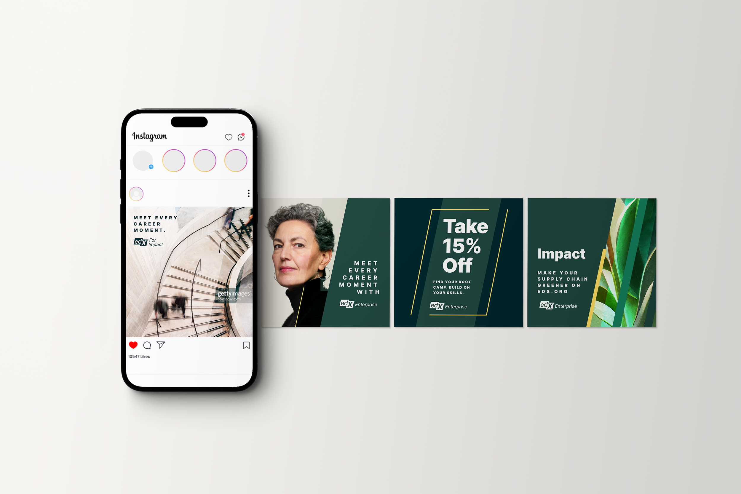
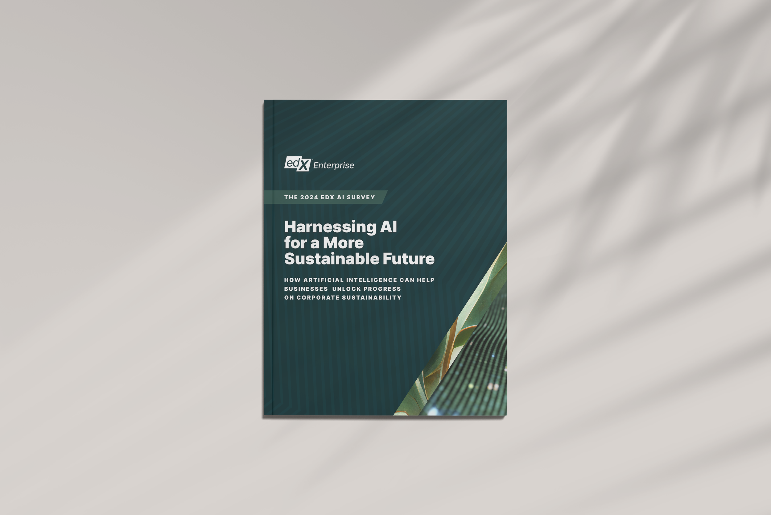
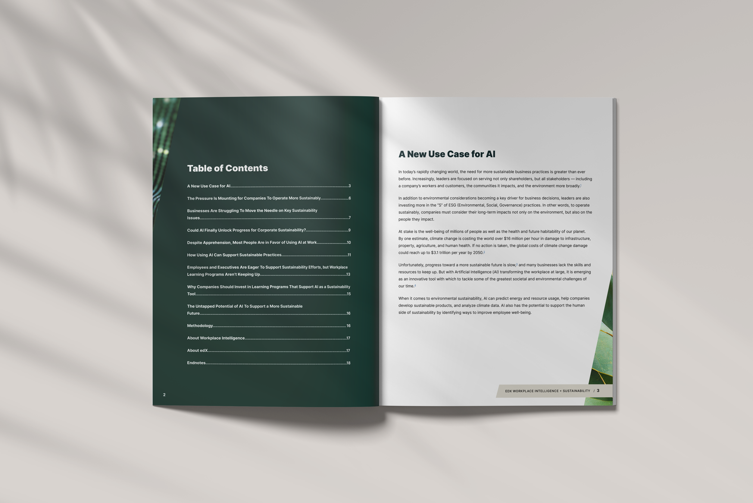
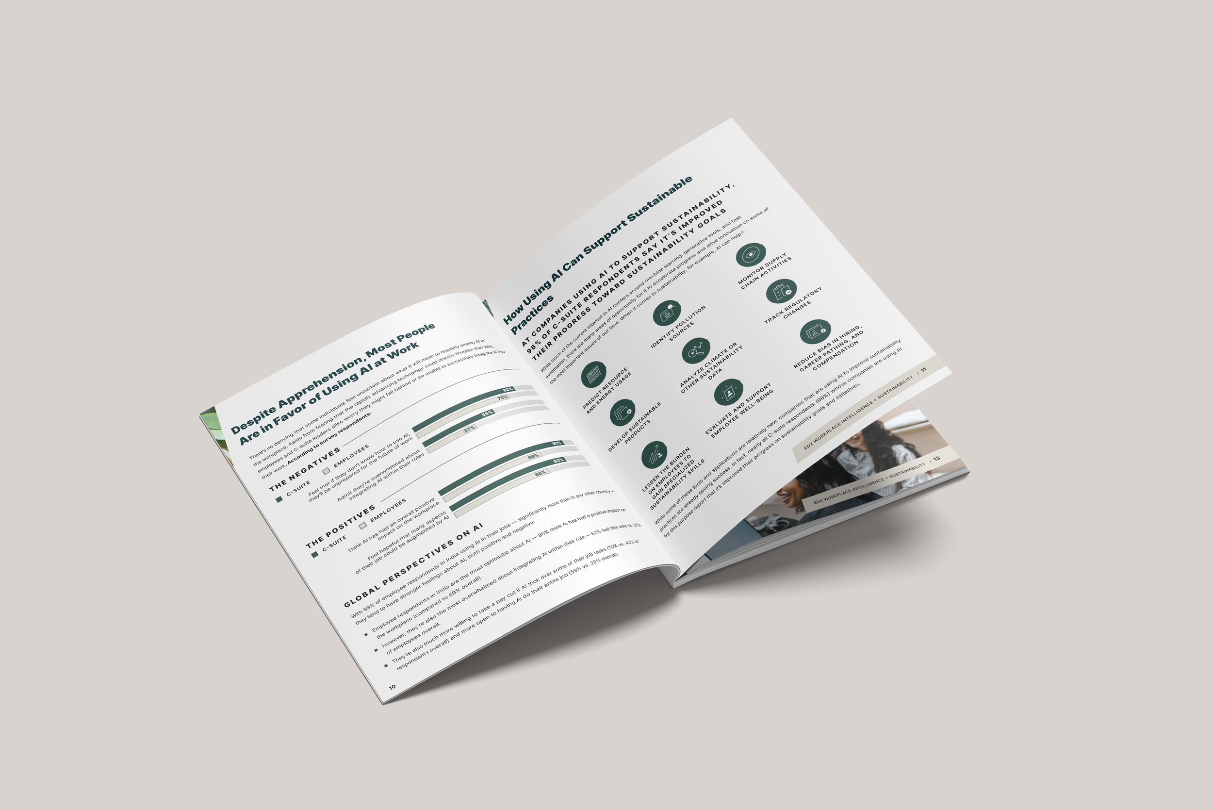
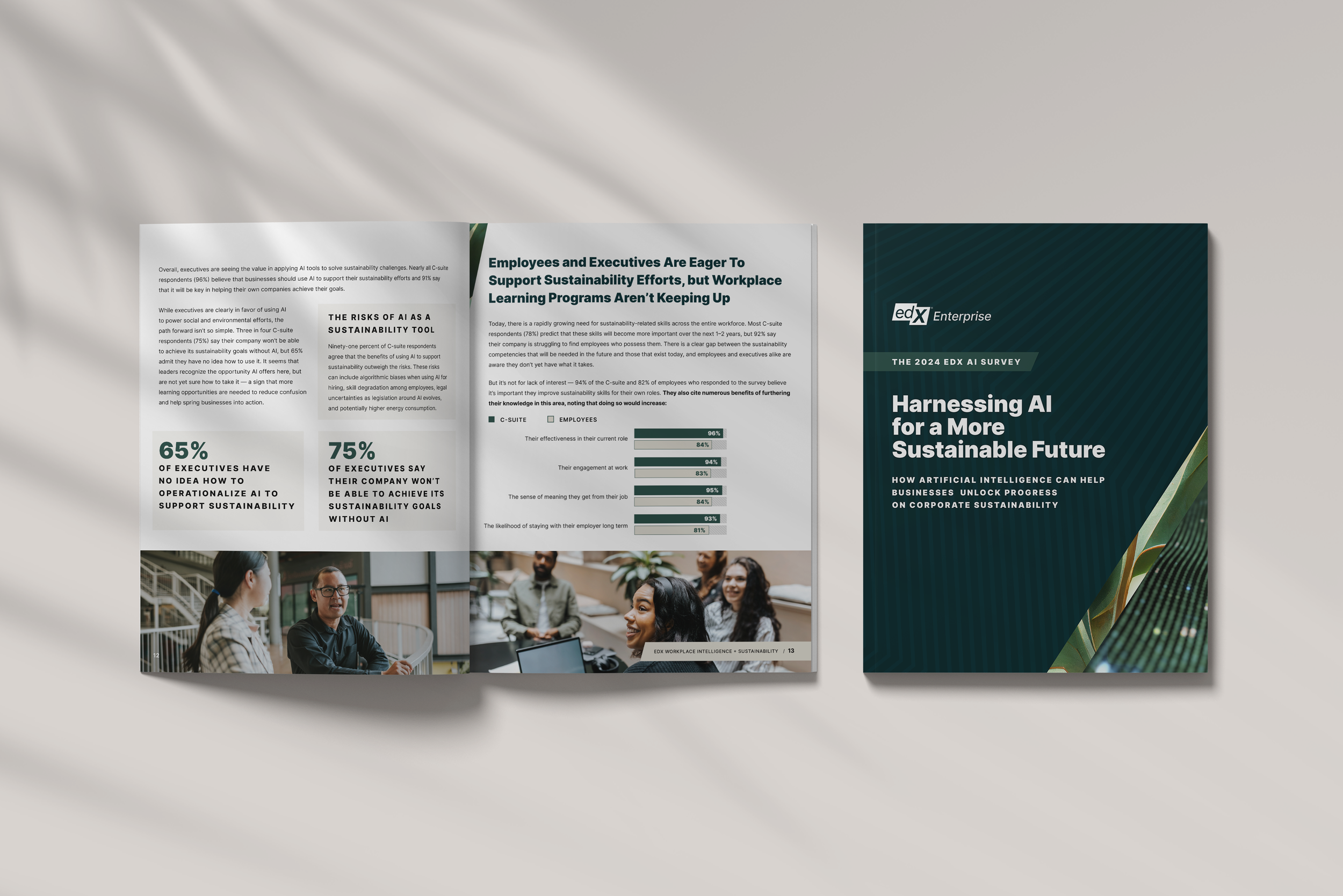
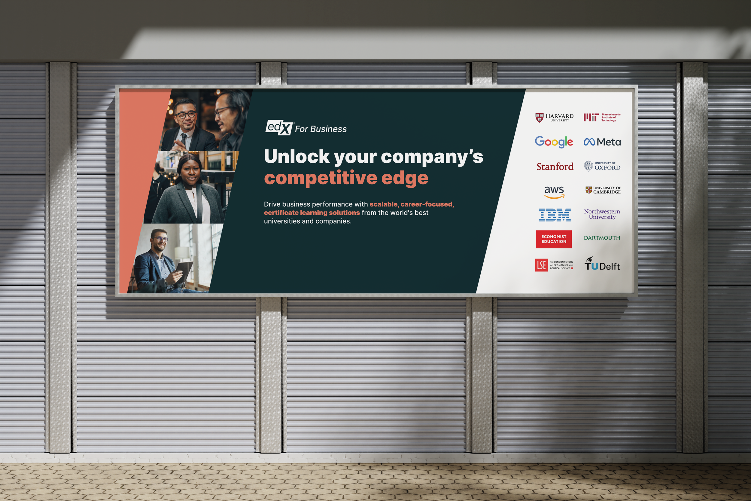
Solutions
The following designs showcase how the creative team used these guidelines to create unique marking collateral. Because the team sits at 20+ designers, production artists, and writers, the guidelines had to be communicated in a way that maintained the foundational rules while also allowing space for creative freedom and flexibility.
These assets were included to showcase the breadth of solutions achieved with the guidelines established.